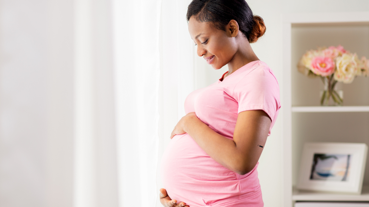
A baby shower invitation does more than share a date and place, it sets the mood before the first guest even arrives. In 2026, the best baby shower invitation designs feel personal, modern, and matched to the theme, with soft colors, natural textures, and clean layouts leading the way.
If you want an invite that feels sweet without looking busy, you’re in the right place. These ideas mix classic charm, trendy details, and creative touches, so you can find a style that fits your shower and feels true to the celebration.
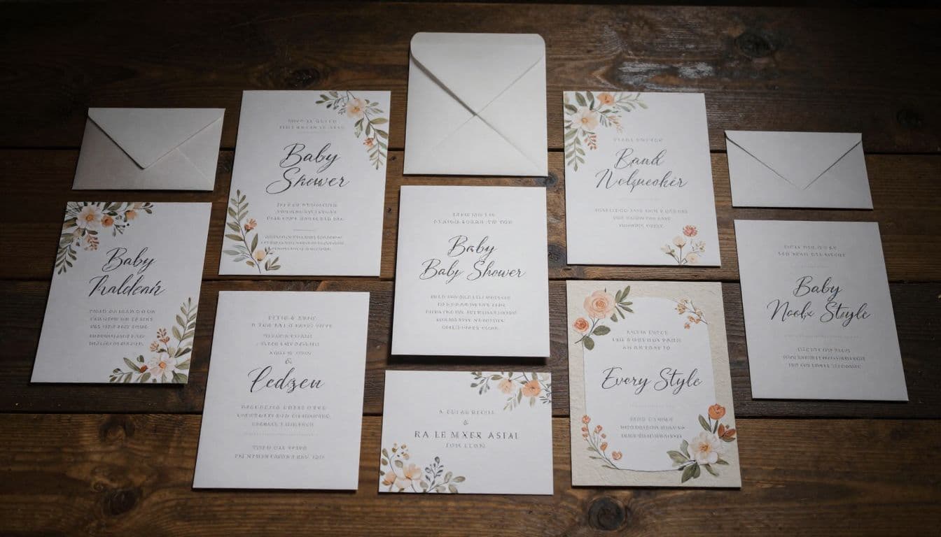
The first designs below show how a simple invitation can still feel special, warm, and memorable.
What Makes a Baby Shower Invitation Stand Out?
A beautiful baby shower invitation feels calm at first glance and clear on second look. The best ones do not crowd the page with too many colors, fonts, or flourishes. Instead, they balance style and clarity so the invite feels polished, warm, and easy to love.
The strongest designs also match the event itself. A formal invite should feel elegant, a rustic one should feel relaxed, and a playful shower should look cheerful without getting messy. That first impression matters, because the invitation is the guest’s first glimpse of the celebration.
Choose a style that matches the shower theme
The invitation should feel like a preview of the party, not a separate idea. If the shower is a garden party, soft florals and airy layouts make sense. For a boho shower, earthy tones, dried grass details, and casual fonts fit the mood well. Celestial themes lean into moons, stars, and deep, dreamy blues, while storybook designs can use gentle illustrations and whimsical borders.
Western showers, on the other hand, work best with warm neutrals, saddle tones, and subtle rustic textures. Minimal themes look strongest with clean spacing, simple icons, and one or two standout design details. When the theme and invite match, everything feels more intentional.
If you want more inspiration for the kind of party food that fits a polished shower, these baby shower brunch food ideas can help you keep the whole event style consistent.
Use colors that feel soft, warm, or joyful
Color does a lot of the visual work on an invitation. In 2026, popular shades include sage, cream, blush, dusty blue, beige, and gentle pastels. These colors feel soft and current, and they give the design room to breathe.
Gender-neutral palettes are especially popular because they keep the invite modern and flexible. Still, brighter colors can work when they are used with care. A sunny yellow border, a muted coral accent, or a pop of teal can add charm without overpowering the page.
A good color palette should feel like a quiet smile, not a shout. That is why soft tones often look more beautiful than loud ones.
For a closer look at current design tools, Canva’s baby shower invitation templates show how color and layout can work together without looking crowded.
Keep the wording easy to read and friendly
Simple wording makes an invite feel modern and welcoming. Guests should be able to spot the key details right away: who, what, when, and where. Short sentences, relaxed phrasing, and clear spacing all help the card feel polished.
Formal wording is less common now than warm, casual language. Phrases like “Please join us to celebrate” or “Come shower the parents-to-be with love” feel natural and friendly. The tone should match the event, so a sweet and simple shower should not read like a formal gala.
Typography matters here too. A clean font for the details and a softer script for the name or title can add charm without making the card hard to read. When the wording feels easy, the whole invitation feels easier to love.
If you’re planning the event around a new arrival, helpful parenting tips for new mothers can also support the kind of thoughtful tone many baby shower hosts want to create.
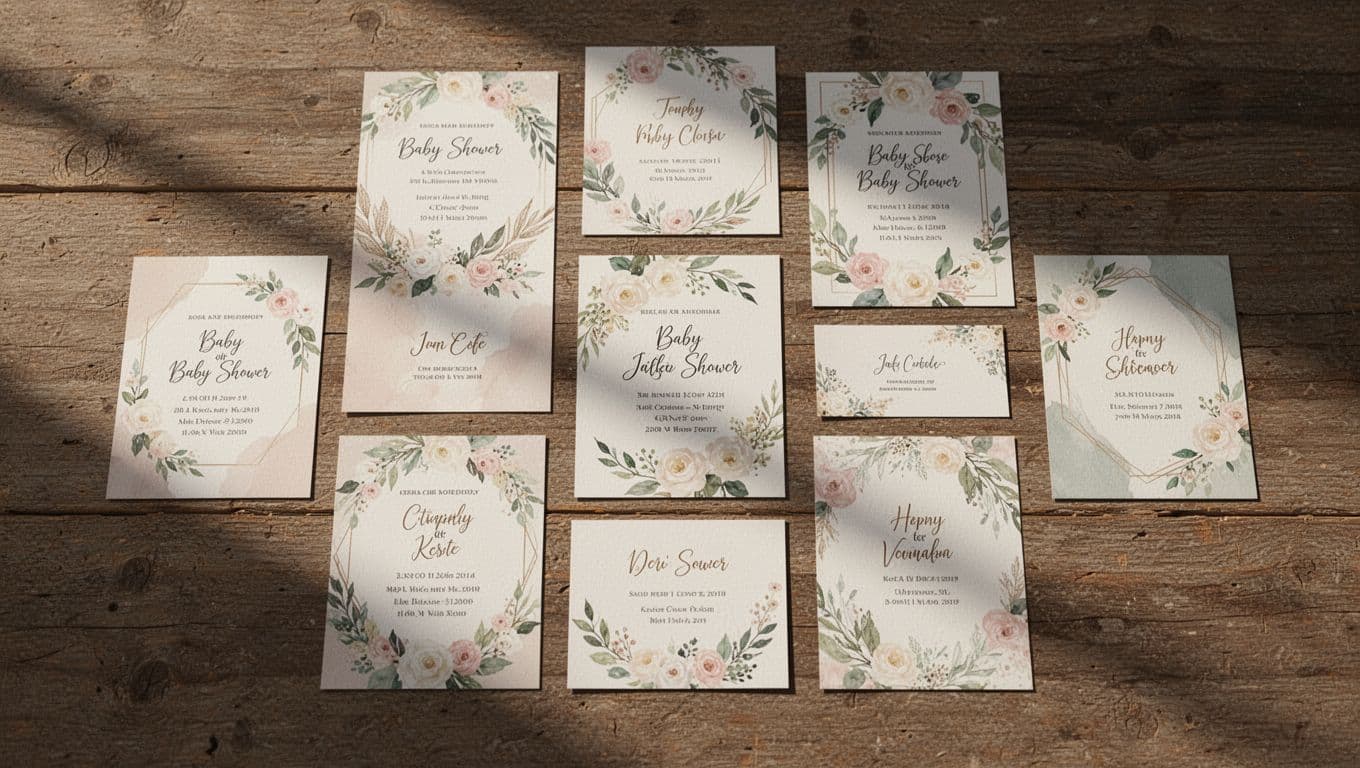
Beautiful Baby Shower Invitation Designs for Every Style
The best baby shower invitations do more than share the details. They hint at the mood of the day, set the color story, and give guests a first look at what to expect. In 2026, the strongest designs feel personal, polished, and easy to read, with soft textures and thoughtful details doing most of the work.
These invitation styles cover the full range, from sweet and romantic to modern and playful. If you’re choosing a design for a baby shower, start with the vibe you want guests to feel the moment they open the card.
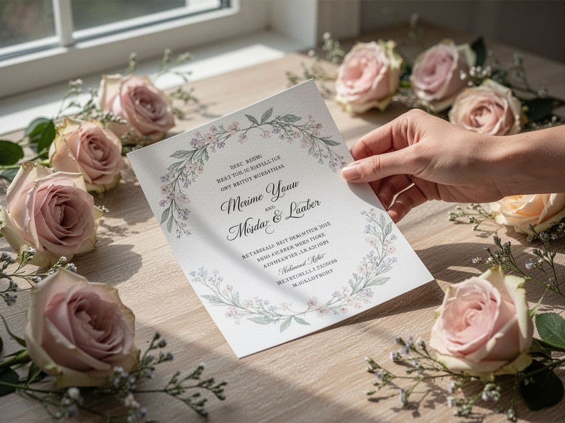
Soft floral invitations for a timeless baby shower look
Soft florals bring an instant sense of warmth and grace. Think airy petals, pale blooms, and light greenery that frame the wording without crowding it. This style works beautifully for spring showers, garden parties, or any event that calls for a gentle, welcoming feel.
Keep the palette soft, with blush, sage, cream, or faded peach. A few loose blooms around the edges can feel romantic without looking too dressed up. For a closer look at floral event styling, trending baby shower themes for 2026 shows how nature-led looks are shaping this year’s party mood.
Minimalist invitations with clean lines and plenty of space
Minimalist invites feel modern because they know when to stop. A crisp font, wide margins, and one strong detail, like a single icon, thin border, or soft color block, can make the whole design feel calm and elegant.
This style works well when you want the wording to shine. It also prints beautifully and reads well on phones, which matters if you plan to send digital invites. Clean spacing gives the design room to breathe, and that open space feels refined rather than bare.
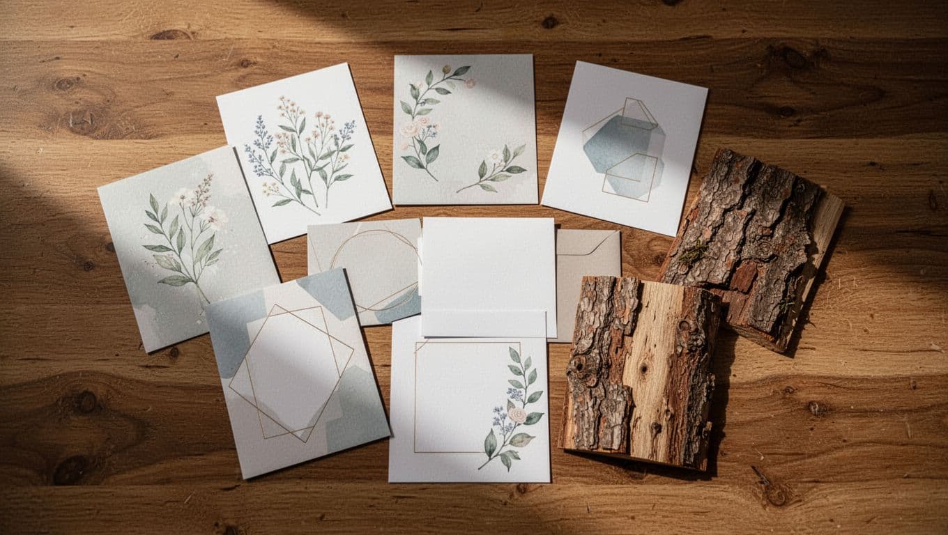
Scrapbook-style invites with layered textures
Scrapbook-inspired invites have a handmade charm that feels personal right away. Layered paper, taped corners, stitched edges, and small cutouts give the card a keepsake feel, like something worth saving in a memory box.
This style is perfect if you want the invitation to feel creative and a little unexpected. Mix in torn paper edges, soft patterned panels, or photo-style frames for depth. The layered look adds character without needing bright colors or heavy decoration.
Natural botanical designs with dried flowers and leaves
Botanical invitations feel calm, fresh, and grounded. Dried flowers, pressed leaves, and simple organic shapes create a look that feels close to nature and easy on the eye. The effect is gentle, not fussy.
Earth tones work especially well here, along with muted greens, ivory, and soft brown accents. This kind of design pairs well with outdoor showers, farmhouse venues, or any celebration that leans into natural beauty. It feels alive in a quiet, understated way.
Celestial invitations for a dreamy baby shower
Moon and star motifs add a soft sense of wonder. A pale sky, tiny constellations, and gentle gold accents can create a dreamy look without feeling dark or dramatic. The result is sweet and a little magical.
This theme works well when you want the invite to feel special but still tender. A crescent moon beside the baby’s name or scattered stars around the details can be enough. A polished celestial style also fits the growing love for elegant, photo-friendly baby shower themes in 2026, as seen in modern baby shower trend ideas.
Storybook-inspired invitations that feel sweet and nostalgic
Storybook invites feel like a page lifted from a favorite childhood tale. Soft illustrations, playful fonts, and fairytale touches make the design feel warm and baby-focused. Little animals, tiny bows, and dreamy scenes all fit this style well.
This look is especially lovely when you want the shower to feel tender and sentimental. Keep the artwork soft and the layout simple, so it stays charming instead of crowded. The best storybook designs feel like a lullaby in paper form.
Boho baby shower invitations with relaxed charm
Boho invitations stay popular because they feel easy, stylish, and current. Pampas grass, woven textures, muted clay tones, and relaxed typefaces create a look that feels casual but still thoughtful.
This style works well for modern showers that want warmth without too much polish. A boho invite can feel earthy, soft, and a little artistic all at once. It also pairs nicely with the broader move toward natural, theme-led showers that feel more personal than formal.
Gender-neutral invitations in soft, balanced colors
Cream, sage, tan, gray, and muted pastels give baby shower invites a calm, flexible look. These colors work for any theme and help the invitation feel current without leaning too hard in one direction.
That balance matters when you want the design to feel welcoming to everyone. Gender-neutral invites also make it easier to match other parts of the shower, from decor to desserts. The palette feels easy, soft, and versatile, which is why it keeps showing up in 2026 designs.
Modern bow and coquette-style invitations
Bow details are everywhere right now, and baby shower invitations are no exception. Soft ribbons, blush tones, and delicate feminine accents create a look that feels cute without crossing into overdone territory.
A coquette-style invite often uses one standout bow as the focus, then keeps the rest of the design simple. That balance is what makes it work. The result feels trendy, sweet, and polished, with just enough charm to catch the eye.
Western-inspired invitations with playful character
Western baby shower invites bring in cowboy boots, hats, rope textures, and warm desert colors. Rust, sand, tan, and faded terracotta set the tone fast, and the theme feels fun right away.
This style works best when it stays playful. A boot illustration, a soft plaid background, or a little star detail can add personality without making the card feel busy. It’s a strong choice for showers that want a little humor and a lot of charm.
Cute animal invitations for a cheerful and childlike feel
Baby animals always feel sweet on an invitation. Little bears, ducks, elephants, bunnies, or woodland creatures bring a friendly mood, especially when the illustrations stay soft and simple.
The best animal invites keep the focus clear. One character, a gentle background, and clean type are usually enough. That keeps the design cheerful instead of crowded, which is exactly what you want for a baby shower.
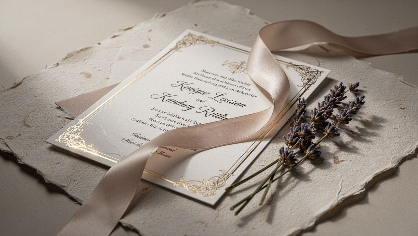
Elegant gold accent invitations for a polished finish
Gold accents make an invite feel special without taking over the page. A foil border, metallic script, or tiny gold stars can add just enough shine to lift the design.
The trick is balance. Pair gold with cream, blush, sage, or white so it feels graceful instead of flashy. When used well, metallic detail gives the invitation a finished, celebratory feel that works for formal showers and modern ones alike.
Watercolor invitations with a soft handmade touch
Watercolor designs bring a light, artistic feel to baby shower invitations. Blended washes of color, soft edges, and hand-painted shapes make the card feel personal and gentle.
This style works well for florals, skies, animals, and abstract backgrounds. It has movement without sharp lines, so the invite feels dreamy from the first glance. If you want something that feels handmade but still polished, watercolor is a strong choice.
Neutral linen and texture-inspired invitations
Texture can do a lot of work on a simple invitation. Linen-like finishes, paper grain, and fabric-inspired backgrounds add richness without needing bold colors or heavy graphics.
This style feels especially good for readers who want something quiet but memorable. A soft neutral palette with visible texture can make even a minimal design feel layered and considered. It’s a subtle detail, but it leaves a strong impression.
Personalized photo invitations that feel close to home
Photo invites add warmth right away, especially when they feature a sonogram, maternity portrait, or a sweet family picture. The design feels one-of-a-kind because it carries a real moment, not just a theme.
This style works best when the photo stays clear and the layout stays simple. A clean border, soft caption, or small decorative touch is usually enough. For many parents, that personal detail turns the invitation into a keepsake guests want to hold onto.
Eco-friendly invitation designs with a natural feel
Eco-friendly invitations often use recycled-paper looks, earthy colors, and simple layouts that waste less visual clutter. The style feels thoughtful and calm, which fits a meaningful family celebration.
Natural browns, soft greens, and cream tones make this look easy to love. You can also add plant-based imagery, seed-paper details, or pared-back printing for a more sustainable approach. It’s a beautiful choice when you want the invite to feel kind as well as pretty.
Playful food-themed invitations for modern showers
Food-themed baby shower invitations feel fresh because they connect right to how people celebrate now. Brunch, café, farmers market, and pizza-party ideas all create a fun tone with very little effort.
A citrus print, a little croissant, or a market basket illustration can make the invite feel current and cheerful. These designs work well for casual showers where the host wants something lighthearted and memorable. They also leave plenty of room for personality.
Rustic baby shower invitations with cozy charm
Rustic invites bring warmth through kraft paper looks, twine details, and soft farmhouse textures. The style feels grounded and inviting, like a hand-written note on good paper.
Muted browns, dusty greens, and cream tones keep the design calm. Add a wood-grain background, a simple border, or a tiny rustic icon, and the whole card feels homey without trying too hard. It’s a natural fit for cozy, intimate showers.
Vintage-inspired invitations with a soft, classic mood
Vintage-style invitations often use lace details, antique-inspired art, old-fashioned fonts, and muted colors. The look feels graceful and familiar, with a touch of old-world charm.
This style still works because it has staying power. A faded floral print or a classic frame can make the invitation feel special without looking dated. For readers who love a timeless finish, vintage is an easy favorite.
How to Pick the Right Invitation Design for Your Shower
The best baby shower invitation feels like a match before guests even open it. It fits the setting, the season, and the people on the guest list, so the design feels natural instead of forced. A soft floral card may shine at a spring garden shower, while a clean minimalist invite may feel right for a small home gathering or a formal venue.
A good invitation also keeps the guest experience in mind. If family members of different ages will receive it, the details should be easy to read and the style should feel welcoming, not confusing. That balance matters just as much as color or font choice.
Match the design to the event setting and season
The venue should guide the invitation first. An outdoor shower often looks best with airy florals, leafy borders, watercolor art, or a soft garden palette. A home gathering can handle a warmer, more relaxed look, such as scrapbook textures, hand-drawn details, or a cozy neutral theme.
Formal venues need a more polished finish. Clean lines, elegant fonts, gold accents, or a simple framed layout help the invitation feel dressed up without becoming stiff. If the shower is in a banquet room or upscale restaurant, the invite should hint at that same level of care.
Season matters too. Spring calls for florals, pastel greens, blush, and fresh botanical touches. Summer works well with bright but softened colors, while fall looks rich in warm tones like terracotta, rust, mustard, and cream. Winter invitations often feel strongest with silver, navy, ivory, or deep green. A season-aware design gives the shower a natural rhythm before the day even arrives.
For readers planning the rest of the event around the invitation, baby shower planning checklist tips can help keep the guest list and venue size in sync.
Think about who will receive the invitation
An invitation should look good to the whole guest list, not just the host. Family members, close friends, coworkers, and older relatives may all see it, so the design needs to feel clear and appealing across age groups. That usually means readable fonts, strong contrast, and details that are easy to spot at a glance.
The parent-to-be’s personality still matters. A playful parent may prefer a cheerful animal print or a fun food theme. Someone with a softer style may love florals, bows, or watercolor art. When the design reflects the guest of honor, it feels more personal and less like a template pulled off a shelf.
A simple test helps here. If the invite feels too busy, too trendy, or hard to read on a phone screen, it needs a reset. Guests should be able to find the date, time, and location without squinting. Good design makes the invitation feel like a friendly welcome, not a puzzle.
If you want to carry the same mood into the celebration itself, creative spring baby announcement ideas can also inspire a softer, more personal visual style.
The best invite is the one people can read fast and remember later.
Choose between printed and digital invites
Printed and digital invitations both work well, and both can look beautiful when done right. Printed cards bring a keepsake feel that many guests love. They feel more formal in the hand, and they suit showers where paper texture, envelopes, and matching inserts matter.
Digital invites are easier to send, easier to track, and kinder to tight timelines. They work well for casual showers, mixed-age guest lists with busy schedules, and hosts who want to update details quickly. If the event might shift slightly, digital is often the simpler choice.
The key is matching the format to the occasion.
| Invitation type | Best for | Style feel | Practical strength |
|---|---|---|---|
| Printed | Formal showers, keepsake events, mailed invitations | Classic and tactile | Strong first impression |
| Digital | Casual showers, quick planning, large guest lists | Clean and flexible | Easy to send and track |
Both formats can feel special. A printed card with soft paper and a clean layout can be just as lovely as a digital invite with a polished design. The better choice is the one that fits your timeline, your budget, and the kind of shower you want guests to expect.
For a balanced look at timing and format, baby shower invitation timing ideas offer helpful planning details for send-out dates and design choices.
Small Design Details That Make a Big Difference
The last layer of a baby shower invitation is often the one people remember most. A nice layout can catch the eye, but the finishing touches are what make it feel polished and complete. Small choices like paper texture, spacing, and accent details can turn a good card into one that feels keep-worthy.
These touches work best when they support the theme instead of fighting it. A soft ribbon, a thin border, or a gentle foil accent can add just enough charm without taking over the design.
Pick fonts that are clear and pleasing to the eye
Font choice changes the mood right away. A playful script can make an invite feel sweet and childlike, while a serif font brings elegance and a clean sans serif gives it a modern edge. The best designs often mix one decorative font with one simple font, so the card feels styled without becoming hard to read.
Readability should always come first. If guests have to squint to find the date or RSVP details, the design has gone too far. A pretty font is only useful when the words still feel easy and natural on the page.
One or two font styles are usually enough. Short names, headings, or the baby’s name can handle a little flair, while the main details should stay crisp. That balance keeps the invitation soft, clear, and easy to love.
Use accents sparingly so the design stays balanced
Small decorative touches can do a lot, but only when they are used with care. Ribbons, bows, stars, florals, and foil accents should frame the design, not crowd it. A few well-placed details often feel more complete than a page full of extras.
The goal is to give the eye a place to rest. A single bow at the top, a light floral corner, or a thin gold line can add charm without making the invite feel busy. When every inch is filled, the design loses its airiness.
A baby shower invitation should feel finished, not over-decorated.
If the theme is already strong, keep the accents subtle. For example, a boho invite may only need one dried-flower motif, while a coquette-style card may only need a ribbon graphic. That restraint makes the whole piece feel more refined.
Make sure the important details are easy to spot
Beauty should never hide the facts. Guests need to find the date, time, location, RSVP information, and registry details without hunting for them. Clear placement and smart spacing make those details feel natural, not crowded into the design.
A simple layout works best here. Put the event name near the top, keep the date and time in a strong visual spot, and separate the RSVP line so it stands out. Registry details can sit lower on the card or on a matching insert if the invitation has room for it.
Paper choice also plays a part in clarity. A smooth finish may feel sleek, while textured paper adds warmth and depth. If you want a more classic printed feel, letterpress baby shower invitations show how paper and typography can create a rich, polished look without extra clutter.
A well-designed invitation is easy to read at a glance and still lovely enough to save. That is the sweet spot, and it matters more than adding one more pretty detail.
Keep spacing, borders, and icons working together
Whitespace gives the invitation room to breathe. Without it, even a beautiful design can feel cramped. Wide margins, careful line breaks, and open space around the main text help each detail stand out.
Borders and icons can help guide the eye when they are kept light. A thin frame, a tiny baby carriage, a soft moon, or a single flower can tie the design together without stealing attention. These elements work best when they repeat the theme in a gentle way.
If you want a cleaner, typography-led look, clean typography invitation ideas are a good reminder that simple spacing can look just as special as layered artwork. The right border or icon should feel like a quiet finishing touch, not another layer of noise.
A good test is simple: if you remove one accent and the card still feels balanced, the design is probably on track. That is the kind of restraint that makes an invitation feel elegant, calm, and memorable.
Conclusion
The best baby shower invitation design is the one that feels right for the parents and the party. Whether the style leans soft and floral, sweet with bows, calm in neutrals, or bold with a clear theme, the invitation should give guests a true preview of the day.
That single detail matters because a thoughtful invite sets the tone before anyone walks through the door. It can feel playful, elegant, cozy, or modern, but it should always stay clear, warm, and personal.
When the design matches the mood you want to create, everything else falls into place. A beautiful invitation does more than share the details, it welcomes people into a celebration they will remember.
Save pin for later

- 20 Baby Shower Table Decor Ideas - July 22, 2026
- How To Raise A Confident Child - June 19, 2026
- Age-Appropriate Chores For Kids (By Age Group) - June 19, 2026